Weyay Bank · Sr. Product Designer · 2021 – 2023
Budgeting and Tracking
Helping young Kuwaitis get a better grasp on their financial planning.


Good morning,
Noor
 Easy save
Money tips3
Yay! Your month is on track
You have 15 more days to go but you only spent KWD 60.000 out of KWD 150.000
 Got it



Explore our stories
Going traveling?
Here’s how to use your card safely
 Tell me more

Shopping online? Here’s how to stay safe
 Tell me more
Offers you’ll ❤️
Get money off the brands you love

stc
Get a whole 15% off. Enjoy!


Deliveroo
Ready to feast? Get 10% off.

View all
 Invite a friendWhen they join Newbank, you’ll both get a reward
 Need some help?Hit up our Solutions Center and we’ll get on it


- Home
 Pay & Transfer
 Rewards
Your account
 KWD1,500.000
KWD 1,500.000


 Add
Addmoney
 Card
Carddetails
 Account
details
Today+ KWD 5.000
 Careem2.000
 Playstation3.000
- ST
 Sulaiman Al Tagni+10.000
YesterdayKWD 5.000
 Arabica1.000
 Spotify1.000
 Uber3.000
Saturday, November 13th+ KWD 8.000
 Kuwait Airways9.000
 You+20.000
 Babel2.000
 Bait Ahmed Cafe1.000
Friday, November 12thKWD 6.000
- STSulaiman Al Tagni5.000
 Starbucks1.000
 Search your transaction history
Search your transaction history
Spending tracker
1 Nov – 30 Nov
Spent of KWD 150.000
You got this. KWD 90 left with 15 days to go 💪🏾
Budget categories
 TransportOver budget12.000spent of 10.000
 Fees, Fines & Loans5.000spent of 10.000
 Vacation & Travel9.000spent of 40.000
 Education2.000spent of 10.000
 Personal Care2.000spent of 15.000
 Home1.000spent of 10.000
Other category spending
 Insurance6.000
 General8.000
Context
Budgeting and Tracking is the part of Weyay’s app that tells you where your money went and how much of the month you have left. Weyay is Kuwait’s first digital bank. The National Bank of Kuwait opened it in November 2021 for customers who had never had a bank of their own.1
shabab/ʃaˈbaːb/
noun, plural
Young people; the youth. Also how you call out to a group of friends: “guys”.

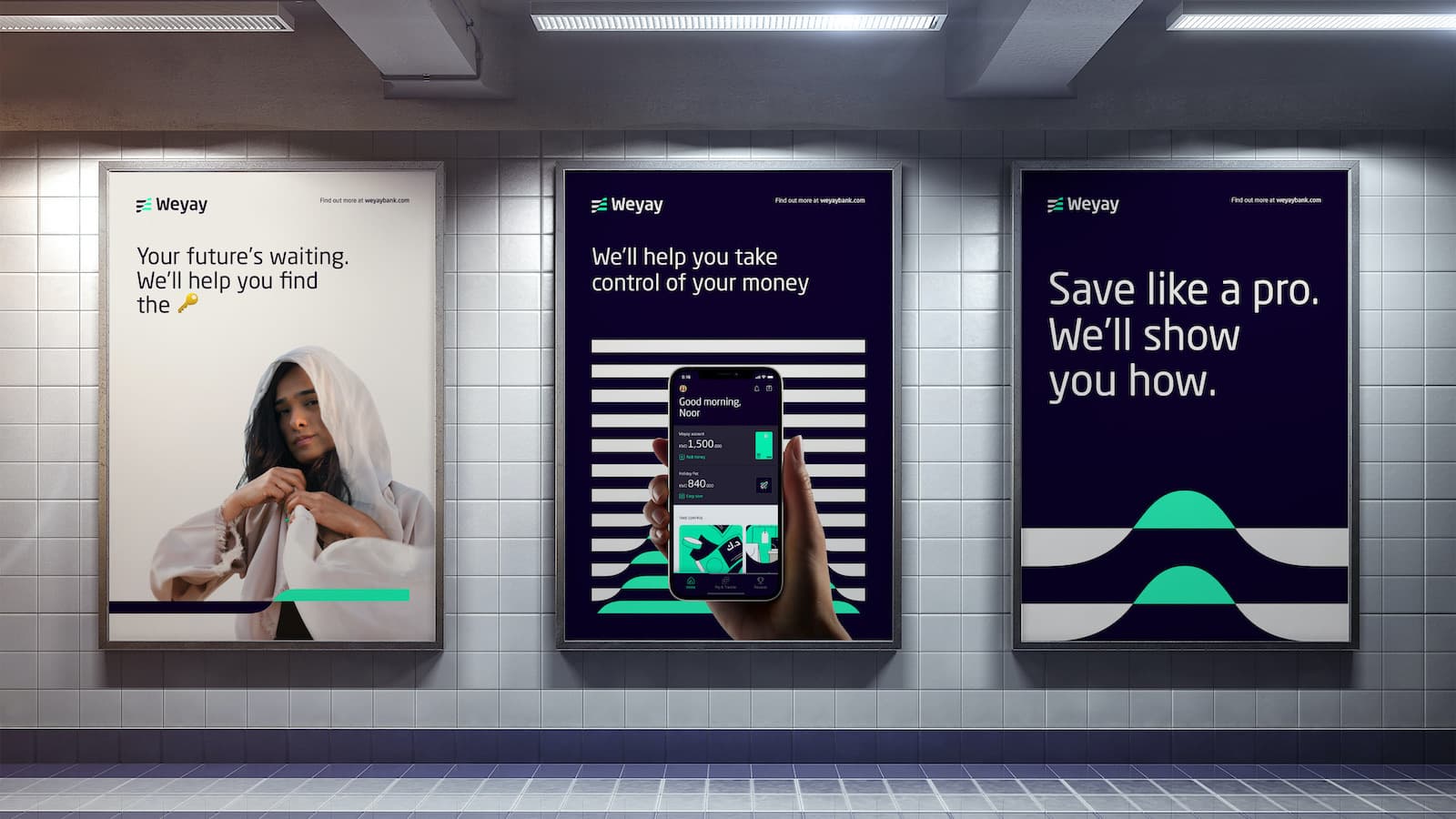
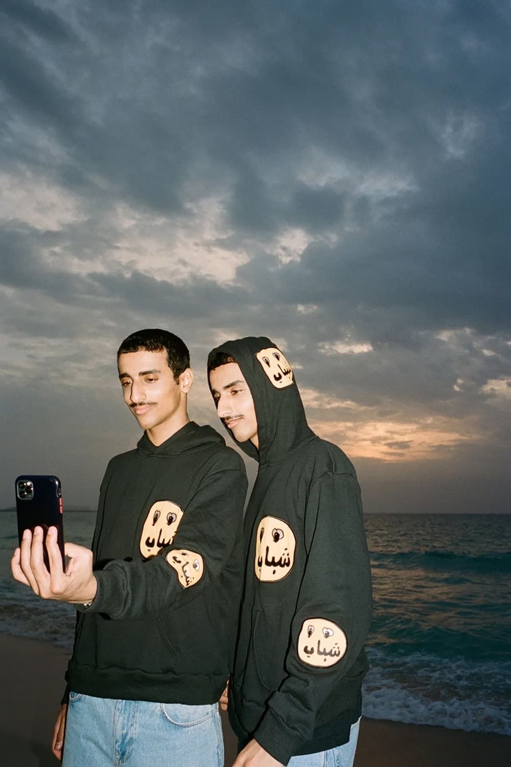
Two thirds of Kuwait’s population is under 34, and when NBK asked 15 to 24 year olds what they wanted from a bank, 80% said tools to manage their own money.1 For most of them the first regular money is the student allowance: a government payment of KWD 200 a month while they study.2 It lands on one day and, by students’ own account, is often spent before the next one arrives. Weyay’s launch advertising was about that day.
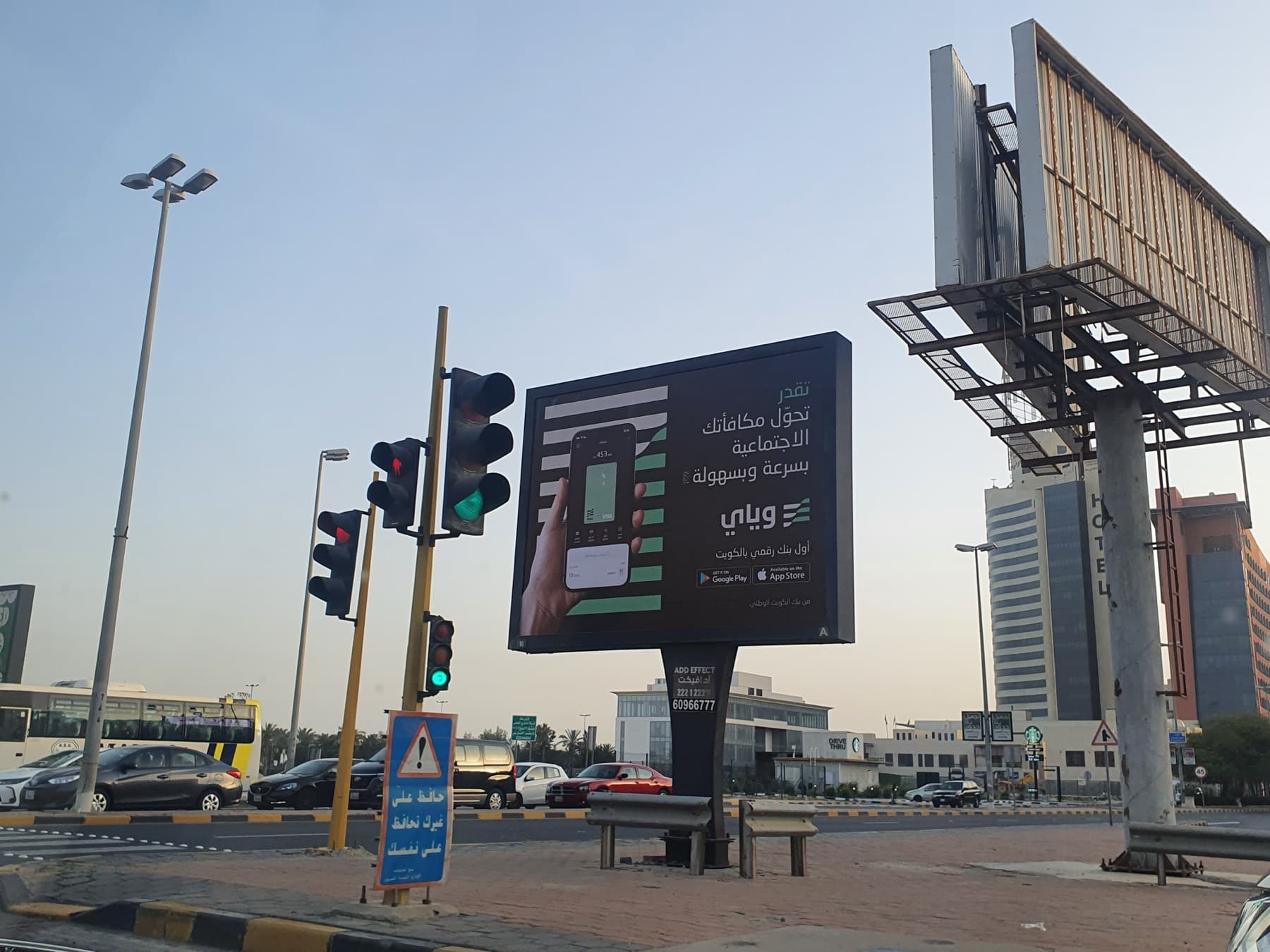
So the question for budgeting was a narrow one. When the allowance lands, what should the app show so that it lasts the month?
The brief added a business goal that pulls the other way: get customers to use their debit card more. A budgeting feature that only says “spend less” works against that. Ours had to make spending feel under control, not forbidden.
TODO (Guillem): the number this feature was meant to move, and how it was going to be measured.
My role
I was one of two senior product designers on the feature, working alongside R/GA, the agency that partnered with NBK to create Weyay.3 The team around us was a UX copywriter, a product manager, a business analyst and a scrum master. Engineering was done by another company, so the designs were the specification: English and Arabic, left to right and right to left.
TODO (Guillem): which flows were mine, how the two of us split the work, who on the team was R/GA and who was the bank, how long it took, and how we handed over to the engineers.
Process
A brief with 21 lines
The feature arrived as a requirements document: 21 numbered lines, each with a release and a priority. The must-haves were money tips, the entry points, a budget for the month and for each category, an overview of spending against it, and two notifications: one when you get close to a limit, one when you pass it.
Two things in that document shaped everything after. Spending data came from a third-party engine, so we could only show what it could return: a fixed list of categories, no budgets by merchant, none by sub-category. And the bank’s own principles asked for the opposite of a finance dashboard: easy to use, simple, easily digestible, less formal. Budgeting belongs to the first of the bank’s two promises, take control of your money; the second is unlock your future.
One slot on Home, five states
A feature nobody opens does nothing, and budgeting has no tab of its own: the tab bar is Home, Pay & Transfer and Rewards. So it is reached from where the money already is.
On Home, one card in the money tips changes with the state of your month. With no budget, it offers to set one. With a budget running, it says how the month is going. When the month closes under budget, it offers to move what is left into a saving pot, which is another product of the bank. The other two ways in are the Track spending shortcut on the account screen and a push notification.
Good morning,
Noor
Easy saveMoney tips3
Yay! Your month is on track
You have 15 more days to go but you only spent KWD 60.000 out of KWD 150.000
Got it
Explore our stories
Going traveling?
Here’s how to use your card safely
Tell me more
Shopping online? Here’s how to stay safe
Tell me more
Offers you’ll ❤️
Get money off the brands you love
stc
Get a whole 15% off. Enjoy!
Deliveroo
Ready to feast? Get 10% off.
View all
- Invite a friendWhen they join Newbank, you’ll both get a reward
- Need some help?Hit up our Solutions Center and we’ll get on it
- Home
- Pay & Transfer
- Rewards
Your account
KWD1,500.000KWD 1,500.000
Addmoney
Carddetails
Accountdetails
Today+ KWD 5.000
- Careem2.000
- Playstation3.000
- STSulaiman Al Tagni+10.000
YesterdayKWD 5.000
- Arabica1.000
- Spotify1.000
- Uber3.000
Saturday, November 13th+ KWD 8.000
- Kuwait Airways9.000
- You+20.000
- Babel2.000
- Bait Ahmed Cafe1.000
Friday, November 12thKWD 6.000
- STSulaiman Al Tagni5.000
- Starbucks1.000
Search your transaction history
Search your transaction history
Spending tracker
1 Nov – 30 Nov
Spent of KWD 150.000
You got this. KWD 90 left with 15 days to go 💪🏾
Budget categories
- TransportOver budget12.000spent of 10.000
- Fees, Fines & Loans5.000spent of 10.000
- Vacation & Travel9.000spent of 40.000
- Education2.000spent of 10.000
- Personal Care2.000spent of 15.000
- Home1.000spent of 10.000
Other category spending
- Insurance6.000
- General8.000
One number, then the rest
The tracker opens on a ring and one number: what you have spent of your budget, with one sentence under it. On the 15th of the month that sentence is “You got this. KWD 90 left with 15 days to go.” It answers the question most people open the screen with, and everything below it is optional.
The brief described a bar chart with a switch to compare spending against budget. The design has no switch: every category row carries both numbers and a line that fills as you spend, so there is nothing to turn on. The second tab, By category, shows the same month as a ring of its five largest categories. Tap a segment and it tells you whether that category is within budget, over it, or not in the budget at all.
Day one
What do you suggest for app at day one or customer at day one?
That line is from the project’s question log, in October 2021. Every benchmark we had been given was a live product with years of transactions behind it; a bank that opens tomorrow has none. So the empty tracker does not draw a chart at zero. It shows where the chart will be, lists every category at 0.000, and asks for one thing: set a budget.

Spending tracker
1 Nov – 30 Nov

Spent
Set a budget and we’ll help you stick to it 👊🏾
 See insights
Spend by category
 Shopping0.000
- Transport0.000
- Fees, Fines & Loans0.000
- Vacation & Travel0.000
- Education0.000
- Personal Care0.000
- Home0.000
Other categories
- Insurance0.000
- General0.000
Setting a budget is one screen: an amount for the month, the day it renews, and an optional amount per category, each with what you spent on it last month as a reference.
Before it goes wrong, and when it goes right
Two notifications were must-haves: one when you reach 80% of a budget, one when you pass it. The second opens the tracker in its over-budget state: the ring closed, in the alert color, and “Over budget” on the categories that caused it.
Spending tracker
1 Nov – 30 Nov
Spent of KWD 150.000
 Edit budgetSee insights
Budget categories
- ShoppingOver budget52.000spent of 30.000
- TransportOver budget24.000spent of 10.000
- Fees, Fines & Loans10.000spent of 10.000
- Vacation & Travel40.000spent of 40.000
- Education10.000spent of 10.000
- Personal Care15.000spent of 15.000
- Home10.000spent of 10.000
Other categories
- Insurance12.000
- General11.000

9:16
Monday, November 15


swipe up to open
The brief also asked for the opposite moment, and called it a signature moment: staying within budget should be celebrated. When a month closes under budget, Home says so, offers to move the difference into a saving pot, and tells the month back to you in five stories: what you spent, how it compares with the rest of the year, and where it went.
Testing with ten shabab
In December 2021, in the sixth round of testing on the app, we tried the prototype with ten young Kuwaitis over three days. Each came with a parent. They used the Arabic prototype on a phone while we recorded the screen, and an Arabic translator sat with us so that we could note what they said as they said it.
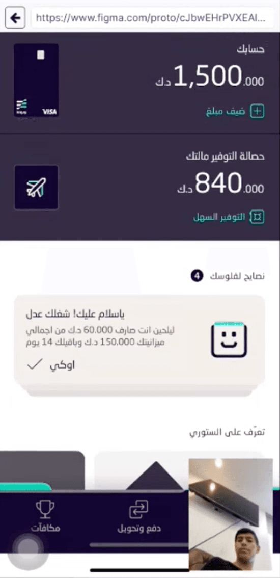
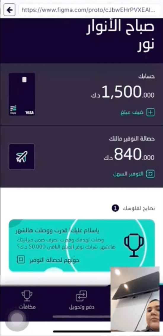
Afterwards every observation went on one board: a row for each part of the feature, and a column for each step from what we saw to what we would change.
Nobody in those sessions used a tool to track their money. They checked the account, or wrote a budget on paper. Once they understood the tracker they liked it; getting there took our help, and the board says where.
Overall takeaways
- Card interactions
- There was some friction in understanding how to move through the cards, and whether a card could be tapped for more detail.
- Achievement
- Most participants appreciated the moment of celebration: being able to move their extra money to their saving pots.
- Progress and guidance
- Most people connected emotionally with the copy and the emoji of the messages that guided them. They liked being guided.
Then we asked ourselves one question.
How might we make budgeting and tracking more progressive and contextual?
One of the changes that came out of it was the cards on Home with messages, which we called Money tips. The idea was a connected experience: an ongoing system of messages that helps people discover how to start tracking their budget from the moment the allowance arrives, shows them how we can support them, and celebrates with them when they are on track.
Good morning,
Noor
Easy saveMoney tips3
Yay! Your month is on track
You have 15 more days to go but you only spent KWD 60.000 out of KWD 150.000
Got it
Explore our stories
Going traveling?
Here’s how to use your card safely
Tell me more
Shopping online? Here’s how to stay safe
Tell me more
Offers you’ll ❤️
Get money off the brands you love
stc
Get a whole 15% off. Enjoy!
Deliveroo
Ready to feast? Get 10% off.
View all
- Invite a friendWhen they join Newbank, you’ll both get a reward
- Need some help?Hit up our Solutions Center and we’ll get on it
- Home
- Pay & Transfer
- Rewards
Your account
KWD1,500.000KWD 1,500.000
Addmoney
Carddetails
Accountdetails
Today+ KWD 5.000
- Careem2.000
- Playstation3.000
- STSulaiman Al Tagni+10.000
YesterdayKWD 5.000
- Arabica1.000
- Spotify1.000
- Uber3.000
Saturday, November 13th+ KWD 8.000
- Kuwait Airways9.000
- You+20.000
- Babel2.000
- Bait Ahmed Cafe1.000
Friday, November 12thKWD 6.000
- STSulaiman Al Tagni5.000
- Starbucks1.000
Search your transaction history
Search your transaction history
Spending tracker
1 Nov – 30 Nov
Spent of KWD 150.000
You got this. KWD 90 left with 15 days to go 💪🏾
Budget categories
- TransportOver budget12.000spent of 10.000
- Fees, Fines & Loans5.000spent of 10.000
- Vacation & Travel9.000spent of 40.000
- Education2.000spent of 10.000
- Personal Care2.000spent of 15.000
- Home1.000spent of 10.000
Other category spending
- Insurance6.000
- General8.000
Good morning,
Noor
Easy saveMoney tips1
Yay! You smashed it this month
You stayed within your monthly budget by KWD 50.000. Want to save it?
 Move to pot

Explore our stories
Going traveling?
Here’s how to use your card safely
Tell me more
Shopping online? Here’s how to stay safe
Tell me more
Offers you’ll ❤️
Get money off the brands you love
stc
Get a whole 15% off. Enjoy!
Deliveroo
Ready to feast? Get 10% off.
View all
- Invite a friendWhen they join Newbank, you’ll both get a reward
- Need some help?Hit up our Solutions Center and we’ll get on it
- Home
- Pay & Transfer
- Rewards
The money tips brought a problem of their own: they were not the only cards on Home. Messages about the account already lived in the same place, and a tip about spending could end up competing with a notice that an ID had expired. So the cards got a hierarchy, three levels, each with its own color, its own rules for being dismissed, and its place in the order.
1. Alert cards

For very important messages that need an action. They cannot be dismissed, and they go away by themselves once the issue is solved.

Your Civil ID has expired
To continue using the Weyay app, please renew your Civil ID in PACI, then update your information here in the next 30 days.
Go to PACIAlready renew it2. Message cards
Mostly to encourage an action now that prevents a problem later. They can be dismissed.

Your details expire in 1 month
To keep using all the great features of your account, you need to update your information before 15.12.2021
 Update your details
3. Money tips
To tell people about their spending and encourage them to use budgeting. They are dismissed by swiping to the left.
Yay! Your month is on track
You have 15 more days to go but you only spent KWD 60.000 out of KWD 150.000
Got it
What testing changed
The second chart was one swipe away, and nobody swiped. The two charts sat in a carousel. Most participants only found the category chart when we told them it existed. They became two labeled tabs, Overall and By category. In the next round, moving between them needed no help.
A percentage reads as a discount. The category chart showed each category as a percentage. Some took it for a discount; others could not tell whether 33% was of their spending or of their budget. The chart now speaks in amounts: KWD 15 spent of KWD 30.
Nobody found the way in from the account. It was a small icon in the top bar, and people missed it even after being told it was on the screen. The board’s proposal was to give it one of the four quick actions under the card, in place of Pay a friend. That is where Track spending is now.
A filled line looked like progress, not like a choice. One participant thought the unfilled categories were ones they had not spent on. So a selected category takes a color of its own: mint within budget, yellow over it, white when it has no budget. Round 7 understood mint and yellow. White was understood by one participant; that one we had not solved.
The budget follows the allowance. Most said they would start their budget on the day the allowance arrives, and expected it to repeat every month. The budget screen has a row for exactly that: the day it renews.
Round 7
In March 2022 we ran 13 more interviews, many with people who were already customers. Everyone understood the over-budget state at once, and many called the charts a very strong feature. What it left open: some asked for a guide to budgeting, some wanted to choose their own dates in Insights, and one said what a budgeting feature least wants to hear.
I will use the cards to get insight, but not to change my behaviour.
TODO (Guillem): the sketches of the options we explored before settling on these screens.
Outcome
TODO (Guillem): what shipped of this feature and when, and any number of its own: customers who set a budget, how many stayed within it, what happened to card use.
Acknowledgements
Designed alongside R/GA, with a second senior product designer, a UX copywriter, a product manager, a business analyst and a scrum master, and built by an external engineering team.
- 1Weyay was unveiled, in beta, in November 2021. The figures on Kuwait’s population and on what 15 to 24 year olds asked for are NBK’s, as reported by FinTech Futures on 26 November 2021. ↩
- 2The amount is the one students themselves quote. In the Kuwait Times of 3 September 2024, students said it is often spent before the month ends. ↩
- 3R/GA London and NBK built Weyay from the ground up in twelve months, according to Campaign Middle East, 19 January 2022. ↩